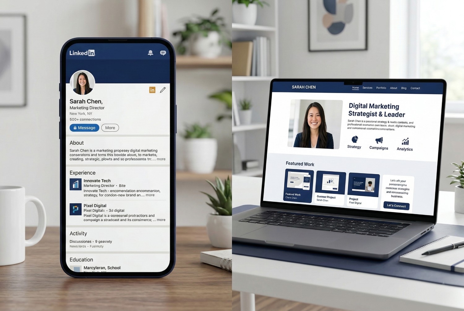
A consultant website should not read like an online brochure. It should feel like a guided conversation with a smart buyer who wants answers quickly. If the structure is right, the visitor moves from interest to trust without much friction. If the structure is vague, even strong credentials can get lost.
The good news is that the pages that win work tend to follow a simple pattern. They make the buyer feel understood, they show evidence, and they make the next step easy.
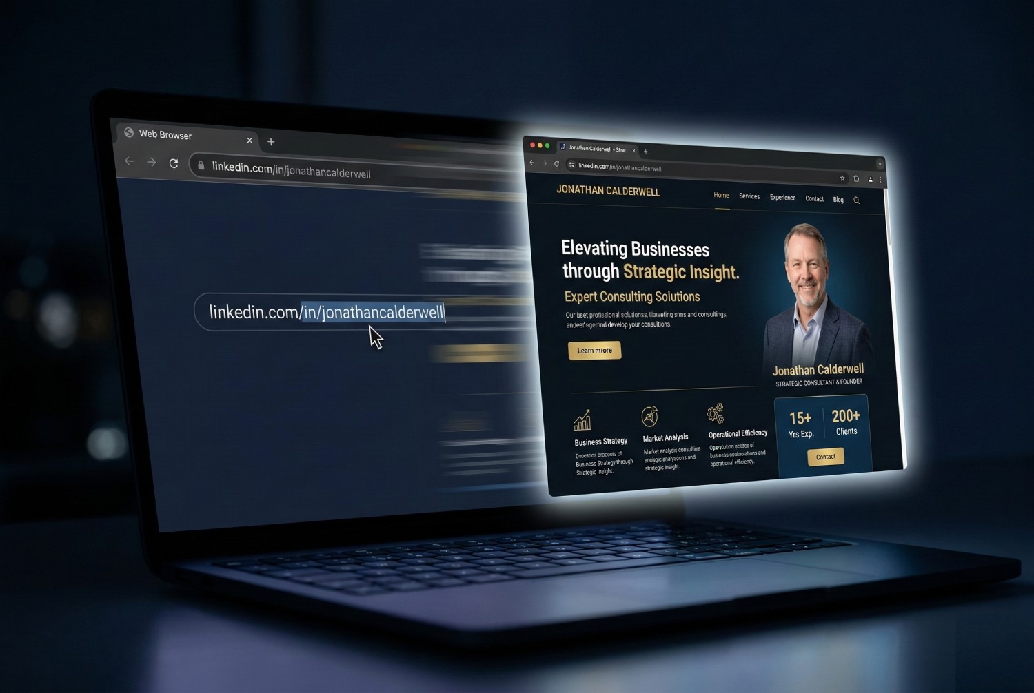
Start with a sharp opening section
Your first screen needs to do one job. It should tell the visitor who you help, what problem you solve, and what kind of outcome you work toward. This is not the place for abstract statements about excellence or leadership. It is the place for clarity.
A founder should know within seconds whether you are relevant to revenue strategy, operational cleanup, leadership coaching, or finance support.
Follow with proof, not more claims
Once the visitor understands the offer, they want reassurance. That is where proof belongs. A short testimonial, a client type they recognize, or one specific outcome does more work than a long paragraph about your philosophy.
Proof lowers the mental cost of contacting you. It tells the visitor that other people trusted you first and had a reason to do so.
Make the service section concrete
Many consultant sites lose momentum in the middle because the service section becomes a list of labels. Strategy advisory. Leadership coaching. Transformation support. Those phrases are familiar, but they are not specific enough to help a buyer picture the work.
- Describe what situations usually lead clients to you.
- Name the deliverables or working style where helpful.
- Clarify who is and is not a fit.
Include a process that feels calm and practical
A simple process section helps people imagine working with you. It does not need to be clever. Three steps is usually enough. Initial conversation. Diagnosis or scope. Ongoing engagement. That kind of structure makes your service feel easier to start.
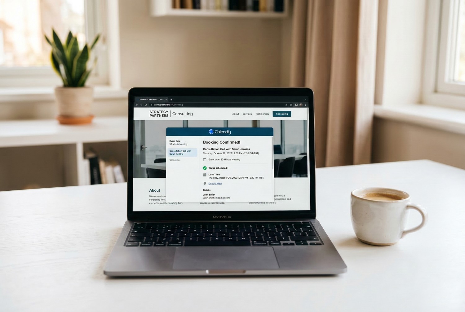
End with a real next step
If the site has done its job, the visitor should not have to wonder what happens next. Give them one clear path. Book a call. Send a short inquiry. Request a proposal conversation. The wording matters less than the clarity.
Many independent professionals accidentally create choice overload by offering too many paths at once. One primary action is usually stronger.
What the best sites have in common
They do not try to sound impressive at every line. They try to be useful. They explain the work in plain language, back it up with evidence, and help the buyer move forward. That is the structure that gets clients because it respects how real people make decisions.